
DILA Technologies®Brand identity for a start-up in Santiago de Chile focusing on delivering renewable lighting solutions for both private and public projects.

Strategy, Creative Direction, Design
Santiago de Chile, 2023


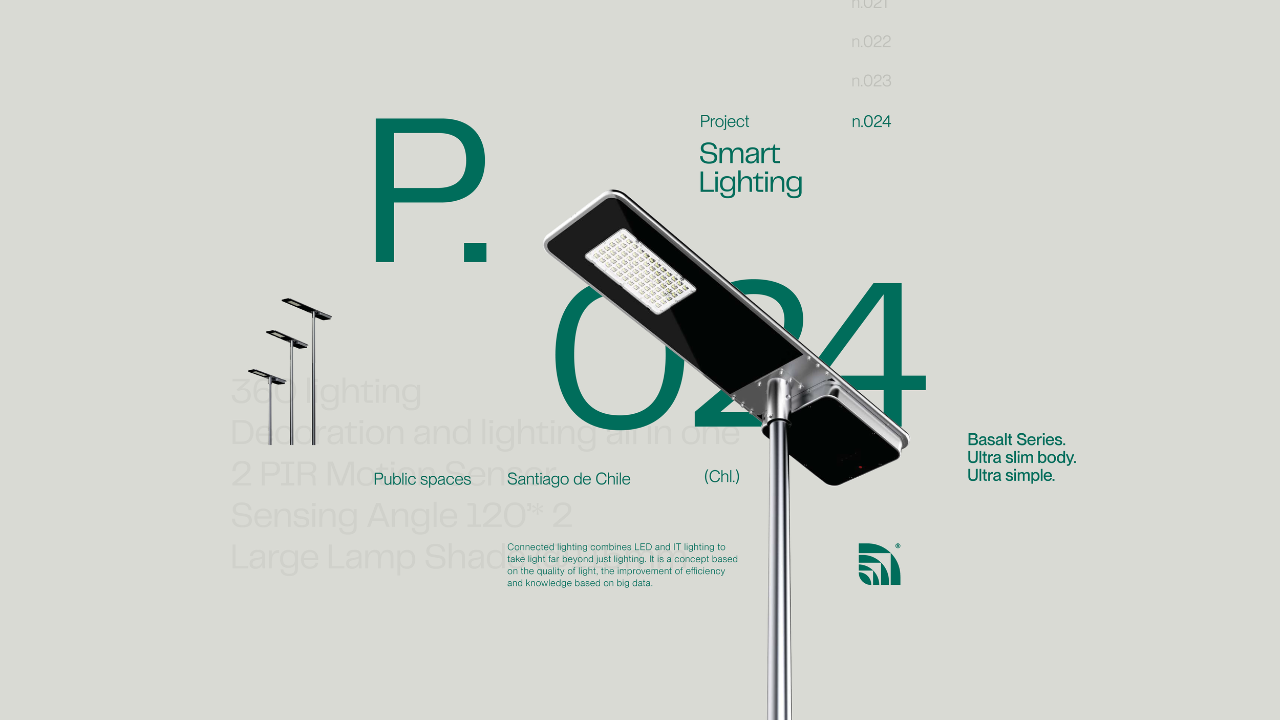
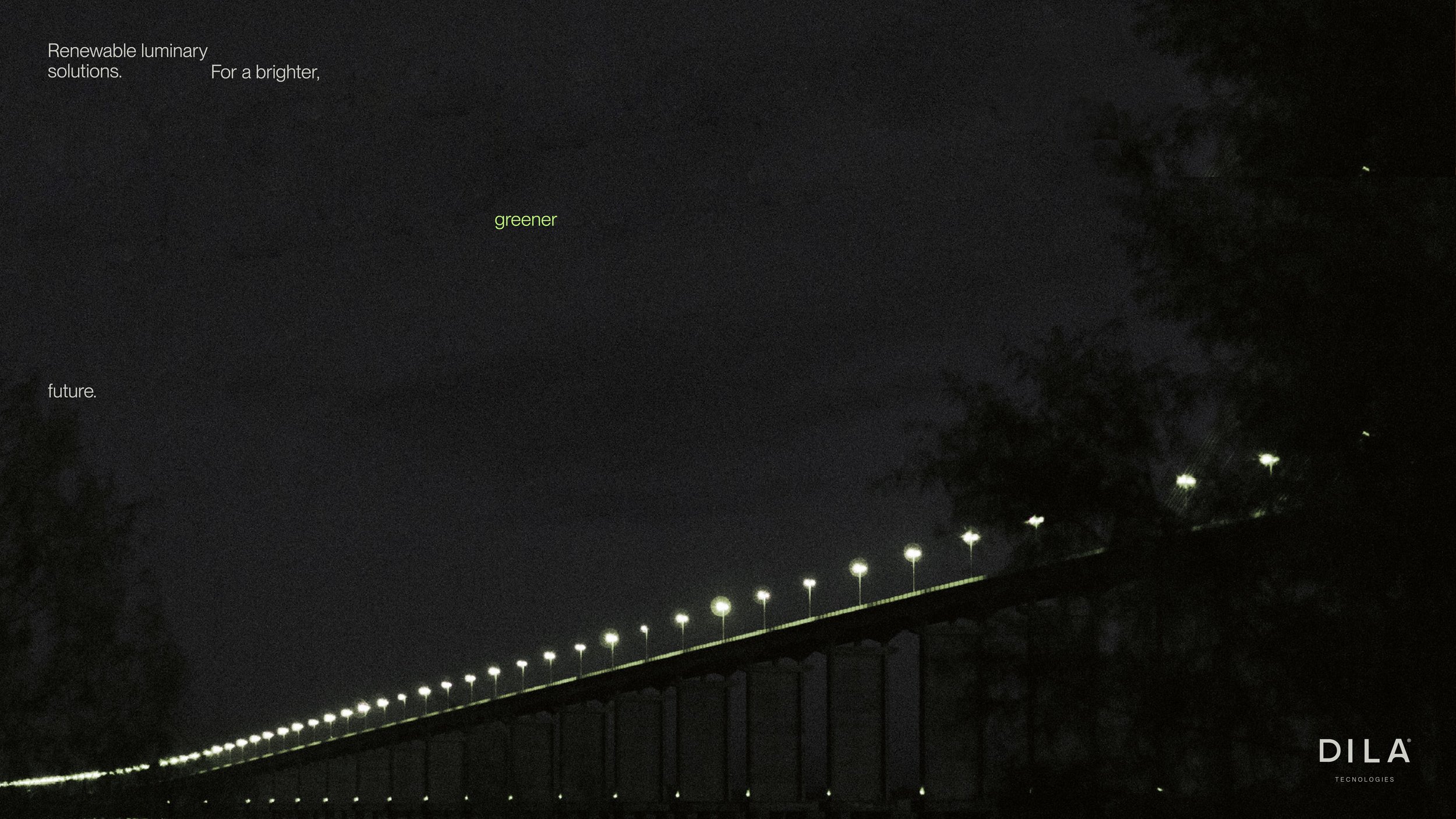
The icon mark speaks to the sustainable & renewable aspects of the products, and mimics the sight of lamp posts as seen from afar. Aside from working as the main identifying element of the brand, it also works as a composition element and from it stems the whole set of icons.
As for the colors, we knew from the get-go that green would be the brand’s main color. The idea behind having a neon-green applied on top of a darker, forest-like green plays along with the idea of DILA bringing light into darkness.


We developed a series of applications that allowed us to expand the visual system, from exploring different ways the logo can be leveraged, to designing typographical compositions and sourcing imagery that spoke to the brand’s concept.